The Difference: Fine Art Portraits and Magazine Cover Portraits
Magazine cover portraits are always trying to advertise a certain product or place, while a fine art portrait is solely to show the model. Both often show moods and a story or meaning.
I really like this photo because of where they draw attention to, and the color really makes the shadows stand out in the picture. It is a very intriguing picture and unique. The smooth skin also makes it very visually appealing.
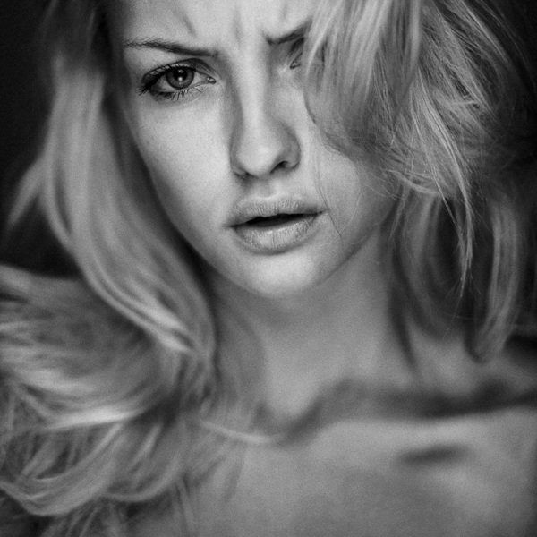
I like this image because it portrayed a deep mood. The shallow depth of field and the black and white draw the eyes to the face and expression. I like how the photographer created a glum, sad mood with the use of the photo techniques, and not only with how the subject was positioned.
This cover of Rihanna is to sell her overall beauty. It relies on her bright red hair to contrast with her skin tone and the background. They also chose an interesting dress pattern that doesn't draw your eyes away from her face as much, and instead complements her skin tone and hair.
I like this magazine cover because of the filter set on it. The pose is also visually appealing and the blurred background brings a lot of attention to the subject being photographed instead of a distracting background.
I love this magazine cover because I want to make a food magazine and this looks very visually captivating in an odd way. The similar colors but slightly different textures make it an interesting picture.